tl;dr: Check out my Observable notebook showing how vast the scale of factory farming is.
Scope insensitivity is our inabiity to grasp really large numbers. When you think about the difference between a million people and a billion people, your brain can’t really represent that thousandfold difference, so it gets compressed down to being abstractly ‘larger’. We don’t suffer the same bias with quantities small enough to visualise.
I wanted to see if I could build visualisations to address this. Numbers on a page don’t do it – is there a way to show these large numbers in a way that people can empathise with?
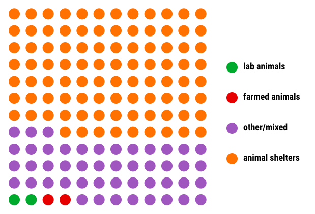
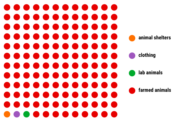
I used some facts and figures from Why Farmed Animals? by Animal Charity Evaluators. They rightly point out that, even though most of the animals killed in the US are killed for food, charities trying to help farmed animals receive very little financial support. Animal shelters receive much more, even though few animals are killed in shelters, relatively speaking.
Using d3-iconarray, I built some figures similar to the ones in the ACE article.
Here’s where Americans donate:
and here’s a very different picture – where animals actually get used:
Some of the figures surfaced are really unbelievable, like this one:
279 chickens [were] killed per second. An additional 13 other farmed animals were killed per second … [T]hese numbers are for the U.S. alone.
292 animals per second – most of whom likely had an unhappy life. This is a staggering number. I wanted to find a way to visualise it, to give it more visual weight.
Initially, I wrote some code to paint dots on the page which would expand and fade out, one per animal killed:
let svg = d3.select(DOM.svg(width, height))
let canvas = svg.append("g")

let paintDot = function() {
    canvas.insert("circle", "rect")
        .attr("cx", Math.random() * width)
        .attr("cy", Math.random() * height)
        .attr("r", 1)
        .style("fill", crimson)
        .transition()
        .duration(5000)
        .ease(Math.sqrt)
        .attr("r", 150)
        .style("fill", "white")
        .remove();
}

// paint a dot every 3.44ms (290 times a second)
d3.interval(paintDot, 3.44)
Under the hood, d3.interval calls requestAnimationFrame(), which runs at 60fps. This isn’t fast enough for rendering 290 objects a second; instead, I wrote functions to render multiple dots near-simultaneously with a total of 290 per second:
let paintTen = function() {
    let i = 0;
    do {
        i += 1;
        paintDot();
    } while (i < 10);
}

let paint29 = function() {
    let i = 0;
    do {
      i += 1;
      paintTen();
    } while (i < 2);
    paintDot();
}

// paint 29 dots 10 times a second
d3.interval(paint29, 100)
I prototyped and published the document using Observable, which is a bit like Jupyter but for HTML/JS. It has a few quirks that require getting used to, but it’s a very powerful tool. You can have text and equations that update in real time, interactive documents with inputs that get fed into your visualisations, and of course it’s an excellent canvas for anything you can think to build in d3.js, WebGL or a number of other web graphics libraries.
You can see the final thing here.